
Summary
In this project, I evaluate the performance and predictive power of a model that has been trained and tested on data collected from homes in suburbs of Boston, Massachusetts. A model trained on this data that is seen as a good fit could then be used to make certain predictions about a home — in particular, its monetary value. This model would prove to be invaluable for someone like a real estate agent who could make use of such information on a daily basis.
The dataset for this project originates from the UCI Machine Learning Repository. The Boston housing data was collected in 1978 and each of the 506 entries represent aggregated data about 14 features for homes from various suburbs in Boston, Massachusetts. For the purposes of this project, the following preprocessing steps have been made to the dataset:
- 16 data points have an
'MEDV'value of 50.0. These data points likely contain missing or censored values and have been removed. - 1 data point has an
'RM'value of 8.78. This data point can be considered an outlier and has been removed. - The features
'RM','LSTAT','PTRATIO', and'MEDV'are essential. The remaining non-relevant features have been excluded. - The feature
'MEDV'has been multiplicatively scaled to account for 35 years of market inflation.
# Import libraries necessary for this project
import numpy as np
import pandas as pd
from sklearn.cross_validation import ShuffleSplit

# Import supplementary visualizations code visuals.py
import visuals as vs

# Pretty display for notebooks
%matplotlib inline

# Load the Boston housing dataset
data = pd.read_csv('housing.csv')
prices = data['MEDV']
features = data.drop('MEDV', axis = 1)

# Success
print "Boston housing dataset has {} data points with {} variables each.".format(*data.shape)
Data Exploration
In this first section of this project, I'm making a cursory investigation about the Boston housing data and provide your observations. Familiarizing myself with the data through an explorative process is a fundamental practice to help us better understand and justify the results.
Since the main goal of this project is to construct a working model which has the capability of predicting the value of houses, I need to separate the dataset into features and the target variable. The features, 'RM', 'LSTAT', and 'PTRATIO', give us quantitative information about each data point. The target variable, 'MEDV', will be the variable we seek to predict. These are stored in features and prices, respectively.
Feature Observation
We are using three features from the Boston housing dataset: 'RM', 'LSTAT', and 'PTRATIO'. For each data point (neighborhood):
'RM'is the average number of rooms among homes in the neighborhood.'LSTAT'is the percentage of homeowners in the neighborhood considered "lower class" (working poor).'PTRATIO'is the ratio of students to teachers in primary and secondary schools in the neighborhood.
Using my intuition, I would guess the following behaviour of the features:
- Number of rooms in the house refers to the size of the house. I guess more rooms has a house, the higher should be its price.
- Percentage of homeowners in the neighborhood considered "lower class" (working poor) refers to the number of working poor people among all people in the neighborhood. This feature might refer to how safe is the house.
According to official statistics provided by the police, courts and the government, in countries like Britain and the USA the working class, the young and some minority ethnic groups are more likely to commit crimes than the middle class, the elderly, females and whites. [1]
So the higher percentage of working poor in the neighborhood, the lower should be the price. - Ratio of students to teachers in primary and secondary schools is hard to predict without the knowledge of the topic. I would guess that reacher shools (or district) has higher budgets for salary so lower ratio of students to teachers. Another guess is choosing the school by the amount of learners in a class, people would prefer the one with less learners and this school might be in higher demand. So I guess the higher ratio of students to teachers, the lower price of the houses.
Calculating Statistics
In order to start familiarizing myself with the data, I calculate descriptive statistics about the Boston housing prices with numpy. These statistics will be extremely important later on to analyze various prediction results from the constructed model.
# Minimum price of the data
minimum_price = np.min(prices)

# Maximum price of the data
maximum_price = np.max(prices)

# Mean price of the data
mean_price = np.mean(prices)

# Median price of the data
median_price = np.median(prices)

# Standard deviation of prices of the data
std_price = np.std(prices)

# Calculated statistics
print "Statistics for Boston housing dataset:\n"
print "Minimum price: ${:,.2f}".format(minimum_price)
print "Maximum price: ${:,.2f}".format(maximum_price)
print "Mean price: ${:,.2f}".format(mean_price)
print "Median price ${:,.2f}".format(median_price)
print "Standard deviation of prices: ${:,.2f}".format(std_price)
It's always important to get a basic understanding of our dataset before diving in. Now we know that a "dumb" classifier, that only predicts the mean, would predict $454,342.94 for all houses.
When dealing with a set of data, often the first thing to do is get a sense for how the variables are distributed. The most convenient way to take a quick look at a distribution is a histogram (seaborn's distplot also visualizes kernel density estimation for our convenience). Solid vertical line represents mean, dashed - median.
import matplotlib.pyplot as plt
import seaborn as sns
clr = ['blue', 'green', 'red']
fig, axs = plt.subplots(ncols=3,figsize=(15,3))

plt.figure(1)

for i, var in enumerate(['RM', 'LSTAT', 'PTRATIO']):
    plt.subplot(131 + i)
    sns.distplot(data[var],  color = clr[i])
    plt.axvline(data[var].mean(), color=clr[i], linestyle='solid', linewidth=2)
    plt.axvline(data[var].median(), color=clr[i], linestyle='dashed', linewidth=2)

According to histograms, RM represents simmetric distribution with mean and median next to each other. LSTAT is positively skewed, has a peak around 5. PTRATIO looks like negatively skewed distribution with the peak around ~20.3.
A lot of common statistical techniques, like linear regression, are based on the assumption that variables have normal distributions or something close to normal distribution. For better visualization I trim the long tails and transformthe x axis of LSTAT and PTRATIO to log10:
fig, axs = plt.subplots(ncols=3,figsize=(15,3))

plt.figure(1)

for i, var in enumerate(['RM', 'LSTAT', 'PTRATIO']):
    plt.subplot(131 + i)
    if i==0:
        sns.distplot(data[var],  color = clr[i])
        plt.axvline(data[var].mean(), color=clr[i], linestyle='solid', linewidth=2)
        plt.axvline(data[var].median(), color=clr[i], linestyle='dashed', linewidth=2)
    else:
        sns.distplot(np.log(data[var]), color = clr[i])
        plt.axvline(np.log(data[var]).mean(), color=clr[i], linestyle='solid', linewidth=2)
        plt.axvline(np.log(data[var]).median(), color=clr[i], linestyle='dashed', linewidth=2)

Log transformation of LSTAT represents close to normal distribution with the peak around 2.6. Transformation of PTRATIO doesn't improve my understanding of the distribution.
To get more feeling about the data, I visualize scatter plots of house prices vs. given three features.
fig, axs = plt.subplots(ncols=3,figsize=(15,3))

for i, var in enumerate(['RM', 'LSTAT', 'PTRATIO']):
    lm = sns.regplot(data[var], prices, ax = axs[i], color=clr[i])
    lm.set(ylim=(0, None))

And LSTAT with log transformation applied:
fig, axs = plt.subplots(ncols=3,figsize=(15,3))

for i, var in enumerate(['RM', 'LSTAT', 'PTRATIO']):
    lm = sns.regplot(np.log(data[var]), prices, ax = axs[i], color=clr[i])
    lm.set(ylim=(0, None))

According to scatterplots, there is a good correlation between house prices and RM, log(LSTAT). There is no strongly marked correlation between prices and PTRATIO. I'm going to visualize the correlation matrix in order to check for correlation between features.
sns.heatmap(data.corr(), square=True,annot=True)

Developing a Model
In this second section of the project, I'm going to develop the tools and techniques necessary for a model to make a prediction. Being able to make accurate evaluations of each model's performance helps to greatly reinforce the confidence in my predictions.
Defining a Performance Metric
It is difficult to measure the quality of a given model without quantifying its performance over training and testing. This is typically done using some type of performance metric, whether it is through calculating some type of error, the goodness of fit, or some other useful measurement. For this project, I'm calculating the coefficient of determination, R2, to quantify my model's performance. The coefficient of determination for a model is a useful statistic in regression analysis, as it often describes how "good" that model is at making predictions.
The values for R2 range from 0 to 1, which captures the percentage of squared correlation between the predicted and actual values of the target variable. A model with an R2 of 0 is no better than a model that always predicts the mean of the target variable, whereas a model with an R2 of 1 perfectly predicts the target variable. Any value between 0 and 1 indicates what percentage of the target variable, using this model, can be explained by the features. A model can be given a negative R2 as well, which indicates that the model is arbitrarily worse than one that always predicts the mean of the target variable.
For the performance_metric function in the code cell below, I implement the following:
r2_scorefromsklearn.metricsto perform a performance calculation betweeny_trueandy_predict.- Assigning the performance score to the
scorevariable.
from sklearn.metrics import r2_score

def performance_metric(y_true, y_predict):
    """ Calculates and returns the performance score between
        true and predicted values based on the metric chosen. """

    score = r2_score(y_true, y_predict)
    return score
Goodness of Fit
Assume that a dataset contains five data points and a model made the following predictions for the target variable:
| True Value | Prediction |
|---|---|
| 3.0 | 2.5 |
| -0.5 | 0.0 |
| 2.0 | 2.1 |
| 7.0 | 7.8 |
| 4.2 | 5.3 |
*Would you consider this model to have successfully captured the variation of the target variable?
Using the performance_metric function I could calculate this model's coefficient of determination.
score = performance_metric([3, -0.5, 2, 7, 4.2], [2.5, 0.0, 2.1, 7.8, 5.3])
print "Model has a coefficient of determination, R^2, of {:.3f}.".format(score)
We can also check out the linear relationship between the 'True Values' and 'Predictions' with a plot:
sample_df = pd.DataFrame([3, -0.5, 2, 7, 4.2], [2.5, 0.0, 2.1, 7.8, 5.3]).reset_index()
sample_df.columns = ['True Value', 'Prediction']
sns.regplot('True Value', 'Prediction', sample_df)

Although the model doesn't perfectly captured the variation of the target variable, it works pretty well and performance petric has a great value of 0.923.
It worth mentioning that R² score is really depends on the domain of the problem. In a well controlled environment such as laboratory testing, we would expect R² to be higher than in a "messy" study full of noisy data, uncertainty regarding measurements, etc.
Shuffle and Split Data
Next I take the Boston housing dataset and split the data into training and testing subsets. Typically, the data is also shuffled into a random order when creating the training and testing subsets to remove any bias in the ordering of the dataset.
In the code cell below, I implement the following:
- Use
train_test_splitfromsklearn.cross_validationto shuffle and split thefeaturesandpricesdata into training and testing sets.- Split the data into 80% training and 20% testing.
- Set the
random_statefortrain_test_splitto 0. This ensures results are consistent.
- Assign the train and testing splits to
X_train,X_test,y_train, andy_test.
from sklearn.cross_validation import train_test_split

X_train, X_test, y_train, y_test = train_test_split(features, prices,
                                                    test_size=0.2, random_state=0)

# Success
print "Training and testing split was successful."
Training and Testing
There are a number of benefits from splitting a dataset.
- If we test the performance of the model on the same data as was used during the training, most probably results will be impressive. But they will just represent the ability of the model to memorize. To get an estimate of the model's performance we need a new unseen dataset;
- The good model should be able not just memorize the training data but be able to generalize: make a good prediction on an unseen before data. The situation when model performs good on a testing set and bad on a training set calls overfitting. Having the different testing set serves as a check on overfitting (or failure to generalize).
Actually, during the tuning of the model's parameteres in order to improve the performance, testing set slowly leak to the model and can't serve as an independent dataset to estimate the performance anymore. That's why splitting the data into 3 sets: training, validation, testing and such methods as cross validation are the good practices.
Analyzing Model Performance
In this third section of the project, I'll take a look at several models' learning and testing performances on various subsets of training data. Additionally, I'll investigate one particular algorithm with an increasing 'max_depth' parameter on the full training set to observe how model complexity affects performance. Graphing the model's performance based on varying criteria can be beneficial in the analysis process, such as visualizing behavior that may not have been apparent from the results alone.
Learning Curves
The following code cell produces four graphs for a decision tree model with different maximum depths. Each graph visualizes the learning curves of the model for both training and testing as the size of the training set is increased. The shaded region of a learning curve denotes the uncertainty of that curve (measured as the standard deviation). The model is scored on both the training and testing sets using R2, the coefficient of determination.
# Producing learning curves for varying training set sizes and maximum depths
vs.ModelLearning(features, prices)

Learning the Data
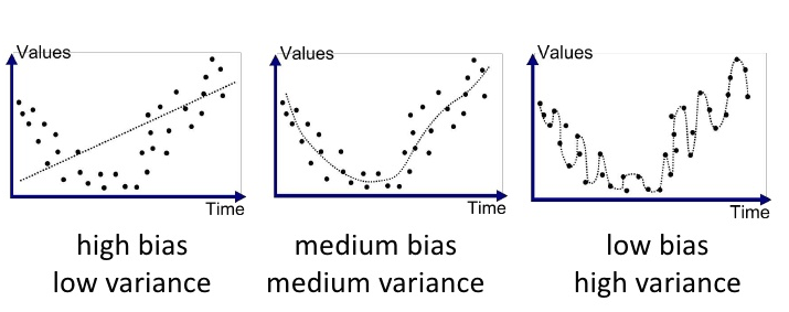
1st and 4th graphs represents biased model and the model suffered from variance respectively. On the first graph with maximum depth 1 training and testing errors converge and are quite high (~0.45). When more training points are added, the scores of the training and testing curves don't improve - no matter how much data we feed it, the model cannot represent the underlying relationship and therefore has systematic high errors.
In practice collecting more data can often be time consuming and/or expensive, so when we can avoid having to collect more data. Therefore sometimes receiving very minor increases in performance is not beneficial, which is why plotting these curves can be very critical at times.
On the forth graph with maximum depth 10 we can see a large gap between the training and testing error which generally means the model suffers from high variance. This model requires limitation of the variance by simplifying the model (f.ex. reducing the number of tree depth). Despite the fact that generally adding more data to the models suffered from the variance imrpoves the performance, graph of this model doesn't confirm it and we can see that testing score tends to go done with adding more data.
3rd graph looks like ideal learning curve among others: the model has good performance to generalize well to unseen data (~0.8), testing and training curves converge at similar values.
Complexity Curves
The following code cell produces a graph for a decision tree model that has been trained and validated on the training data using different maximum depths. The graph produces two complexity curves — one for training and one for validation. Similar to the learning curves, the shaded regions of both the complexity curves denote the uncertainty in those curves, and the model is scored on both the training and validation sets using the performance_metric function.
vs.ModelComplexity(X_train, y_train)

Bias-Variance Tradeoff
- The model, which is trained with a maximum depth of 1, suffers from high bias. Low training score is a good indicator of high bias. Relatively close performance represents low variance.
- The model, which is trained with a maximum depth of 10, suffers from high variance, since we see a large gap between the training and validation scores, as we are basically just memorizing our training data and will not generalize well to new unseen data.
Below is a good visualization of Bias-Variance Tradeoff by Joannes Vermorel [3]:
Best-Guess Optimal Model
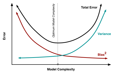
In order to choose the best-guess optimal model I'm looking for a good bias / variance tradeoff as well as for the highest validation score. The maximum depth of 4 results to high validation score and low variance (comparing to max depth of 8 f.ex.) so results in a model that best generalizes to unseen data.
Evaluating Model Performance
In this final section of the project I will construct a model and make a prediction on the client's feature set using an optimized model from fit_model.
Grid Search
Grid search is an exhaustive searching through a manually specified subset of the hyperparameter space of a learning algorithm. It lets us systematically work through multiple combinations of parameter tunes in order to find one with the best model's performance. A grid search algorithm must be guided by some performance metric, typically measured by cross-validation on the training set or evaluation on a held-out validation set.
scikit-learn library offers contains sklearn.model_selection.GridSearchCV which lets us find the optimal parameters for the model without the increase of code's complexity.
Great overview of gridSearch in combination with other techniques might be found in this blog post by Katie Malone.
What is the k-fold cross-validation training technique? What benefit does this technique provide for grid search when optimizing a model?
Hint: Much like the reasoning behind having a testing set, what could go wrong with using grid search without a cross-validated set?
Cross-Validation
When evaluating different hyperparameters for estimators, there is still a risk of overfitting on the test set because the parameters can be tweaked until the estimator performs optimally. This way, knowledge about the test set can “leak” into the model and evaluation metrics no longer report on generalization performance.
To solve this problem, yet another part of the dataset can be held out as a so-called “validation set”: training proceeds on the training set, after which evaluation is done on the validation set, and when the experiment seems to be successful, final evaluation can be done on the test set. [2]
k-fold-cross-validation comes up on the stage to provide validation set without dramatically reducing the amount of data, available for model's training.
The idea is to split the training dataset into k parts same size and perform k independent model trainings using k-1 parts as training data and 1 part as validation data. The average accuracy of k trainings will be the resulting accuracy of the model.
Cross-validation is an extremely important concept in machine learning, as this allows for multiple testing datasets and is not just reliant on the particular subset of partitioned data. For example, if we use single validation set and perform grid search then it is the chance that we just select the best parameters for that specific validation set. But using k-fold we perform grid search on various validation set so we select best parameter for generalize case.
Another example might be when the dataset is not balanced and a simple split could keep all similar data points together and thus train on a very different set, making for a poor model.
Thus cross-validation better estimates the volatility by giving us the average error rate and will better represent generalization error.
The code below visualize the difference between accuracies, calculated on a single subset and 5 folds.
import numpy as np
from sklearn import cross_validation
from sklearn import datasets
from sklearn import svm

iris = datasets.load_iris()

# Split the iris data into train/test data sets with 30% reserved for testing
X_train, X_test, y_train, y_test = cross_validation.train_test_split(iris.data, iris.target, test_size=0.3, random_state=0)

# Build an SVC model for predicting iris classifications using training data
clf = svm.SVC(kernel='linear', C=1, probability=True).fit(X_train, y_train)

# Now measure its performance with the test data with single subset
print 'Single subset performance: ', clf.score(X_test, y_test)

# We give cross_val_score a model, the entire data set and its "real" values, and the number of folds:
scores = cross_validation.cross_val_score(clf, iris.data, iris.target, cv=5)

# Print the accuracy for each fold:
print 'Accuracies of 5 folds: ', scores

# And the mean accuracy of all 5 folds:
print 'Mean accuracy of 5 folds: ', scores.mean()
Fitting a Model
Now it's time for final implementation where I train a model using the decision tree algorithm. To ensure that I'm producing an optimized model, I'm going to train the model using the grid search technique to optimize the 'max_depth' parameter for the decision tree. The 'max_depth' parameter can be thought of as how many questions the decision tree algorithm is allowed to ask about the data before making a prediction. Decision trees are part of a class of algorithms called supervised learning algorithms.
In addition, I'm using ShuffleSplit() as an alternative form of cross-validation. While it is not the K-Fold cross-validation technique, described above, this type of cross-validation technique is just as useful!. The ShuffleSplit() implementation below will create 10 ('n_iter') shuffled sets, and for each shuffle, 20% ('test_size') of the data will be used as the validation set.
from sklearn.tree import DecisionTreeRegressor
from sklearn.metrics import make_scorer
from sklearn.grid_search import GridSearchCV

def fit_model(X, y):
    """ Performs grid search over the 'max_depth' parameter for a
        decision tree regressor trained on the input data [X, y]. """

    # Create cross-validation sets from the training data
    cv_sets = ShuffleSplit(X.shape[0], n_iter = 10, test_size = 0.20, random_state = 0)
    print (cv_sets)
    # Create a decision tree regressor object
    regressor = DecisionTreeRegressor()

    # Create a dictionary for the parameter 'max_depth' with a range from 1 to 10
    params = {'max_depth': range(1,11)}

    # Transform 'performance_metric' into a scoring function using 'make_scorer'
    scoring_fnc = make_scorer(performance_metric)

    # Create the grid search object
    grid = GridSearchCV(estimator=regressor, param_grid=params, scoring=scoring_fnc, cv=cv_sets)

    # Fit the grid search object to the data to compute the optimal model
    grid = grid.fit(X, y)

    # Return the optimal model after fitting the data
    return grid.best_estimator_
Making Predictions
Once a model has been trained on a given set of data, it can now be used to make predictions on new sets of input data. In the case of a decision tree regressor, the model has learned what the best questions to ask about the input data are, and can respond with a prediction for the target variable. I can use these predictions to gain information about data where the value of the target variable is unknown — such as data the model was not trained on.
Optimal Model
Running the code block below to fit the decision tree regressor to the training data and produce an optimal model.
# Fit the training data to the model using grid search
reg = fit_model(X_train, y_train)

# Produce the value for 'max_depth'
print "Parameter 'max_depth' is {} for the optimal model.".format(reg.get_params()['max_depth'])
Grid Search with cross-validation produced the optimal value for maximum depth of 4 which is aligned with my guess earlier here.
Predicting Selling Prices
Now let's imagine that I'm a real estate agent in the Boston area looking to use this model to help price homes owned by my clients that they wish to sell. I've collected the following information from three of my clients:
| Feature | Client 1 | Client 2 | Client 3 |
|---|---|---|---|
| Total number of rooms in home | 5 rooms | 4 rooms | 8 rooms |
| Neighborhood poverty level (as %) | 17% | 32% | 3% |
| Student-teacher ratio of nearby schools | 15-to-1 | 22-to-1 | 12-to-1 |
Let's use the model in order to find the price of the house I should recommend each client to sell at.
# Produce a matrix for client data
client_data = [[5, 17, 15], # Client 1
               [4, 32, 22], # Client 2
               [8, 3, 12]]  # Client 3

# Show predictions
for i, price in enumerate(reg.predict(client_data)):
    print "Predicted selling price for Client {}'s home: ${:,.2f}".format(i+1, price)
One of the cool thing with tree based method is that we can use feature_importances to determine the most important features for the predictions (and understand how we got predicted prices):
sns.barplot(X_train.columns, reg.feature_importances_)

One of the biggest advantages when using a decision tree as a classifier in the interpretability of the model. Therefore we can actually visualize this exact tree with the use of export_graphviz:
from IPython.display import Image
from sklearn.externals.six import StringIO
import pydot
from sklearn import tree

clf = DecisionTreeRegressor(max_depth=4)
clf = clf.fit(X_train, y_train)
dot_data = StringIO()
tree.export_graphviz(clf, out_file=dot_data,
#tree.export_graphviz(reg, out_file=dot_data,
    feature_names=X_train.columns,
    class_names="PRICES",
    filled=True, rounded=True,
    special_characters=True)
graph = pydot.graph_from_dot_data(dot_data.getvalue())
Image(graph.create_png())

Do these prices seem reasonable given the values for the respective features?
In order to answer this questions I should recall the descriptive statistics. I publish them again here:
print "Statistics for Boston housing dataset:\n"
print "Minimum price: ${:,.2f}".format(minimum_price)
print "Maximum price: ${:,.2f}".format(maximum_price)
print "Mean price: ${:,.2f}".format(mean_price)
print "Median price ${:,.2f}".format(median_price)
print "Standard deviation of prices: ${:,.2f}".format(std_price)
Prices for second and third houses are close to the minimum and maximum values (which a little bit confuse me from scratch). Plotting a histogram of all of the housing prices in this dataset and see where each of these predictions fall could give me some more insight.
plt.hist(prices, bins = 30)
for price in reg.predict(client_data):
    plt.axvline(price, c = 'r', lw = 3)

Estimated price for the second house is in the area within one standard deviation below the mean. I would like to see also descriptive statistics on the filtered data to judge on the prediction. Below is the data for the houses with average number of rooms below 4.5 and descriptive statistics:
data[data.RM<4.5]
data[data.RM<4.5].describe()
There are not many houses with average number of rooms around 4. All of them have learners to teachers ration 20.2 (which is a little bit heigher than for second home). There are two houses with comparing high values of the "working poor" ratio and the one with higher value costs $249,900.0 which is >30% more, than predicted price of our house.
So, personally, the predicted price seems unrealistic for me but it can be explained by the small amound of training data or hidden features in the price calculation.
Sensitivity
An optimal model is not necessarily a robust model. Sometimes, a model is either too complex or too simple to sufficiently generalize to new data. Sometimes, a model could use a learning algorithm that is not appropriate for the structure of the data given. Other times, the data itself could be too noisy or contain too few samples to allow a model to adequately capture the target variable — i.e., the model is underfitted. The code cell below run the fit_model function ten times with different training and testing sets to see how the prediction for a specific client changes with the data it's trained on.
vs.PredictTrials(features, prices, fit_model, client_data)
Applicability
This model is hard to use in the real life.
- Today the data from 1978 (even multiplicatively scaled to account for 35 years of market inflation) is not relevant anymore because the real estate market as well as population, salaries, demand have changed dramatically with the buyers.
- How people choose the house or the features of the dataset are not sufficient anymore. People just want something different from the house (is there WiFi inside? is it close to my corporation? etc.). Adding meaningful features to our model may be a good way of reducing the so-called irreducible error, or the error that comes from variation in our target that our predictors are not able to explain.
- The model is not robust enough to make consistent predictions. As was shown in the Sensitivity section, range in prices is around $70k which might be significant.
- More examples are needed: from the different types/sizes of cities, countries, etc.
At the same time there is so much data generated in the World nowadays and the usage of the right features let us build the robust applicable models for solving real-world problems.
References
- Social Groups and Crime http://www.historylearningsite.co.uk/sociology/crime-and-deviance/social-groups-and-crime/
- Cross-validation: evaluating estimator performance. http://scikit-learn.org/stable/modules/cross_validation.html#cross-validation
- Joannes Vermorel, 2009-04-19, www.lokad.com
Comments
comments powered by Disqus